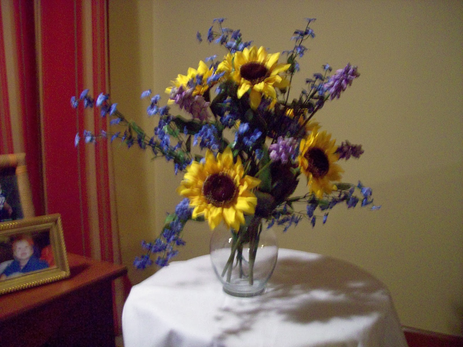
One of the best subjects to learn from in my opinion is flowers. If I make my own arrangement to work from, I learn what colors work best together and how to set up a nice composition. I can also manipulate the lighting – its direction and tint. Because we get some of the best colors in shadows, I always set up my one source of light coming from a side or angled direction rather than face-on. If I took a black and white photo of this, I would have distinct areas ranging from dark to light. This variation in value is what will make the painting–even more than the colors I choose! In this photo, the light is white, but if you want a different tint, use a yellow lightbulb or cover the spotlight with tinted cellophane.
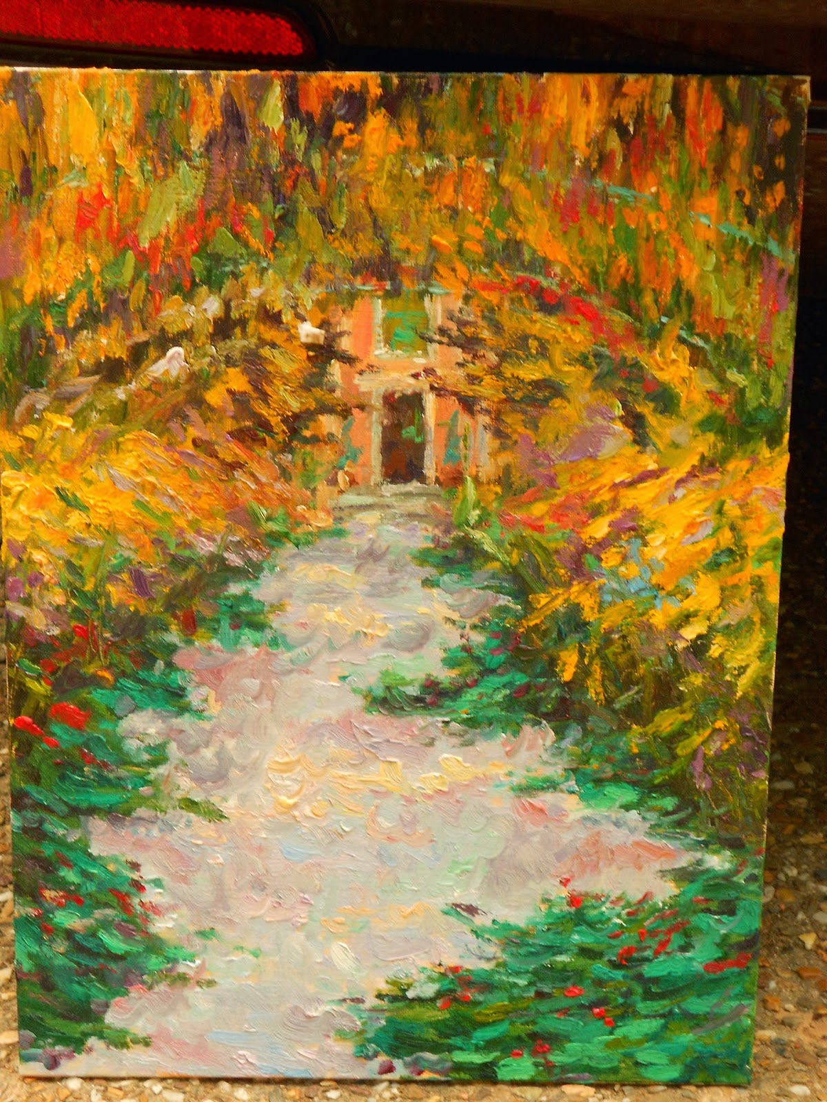
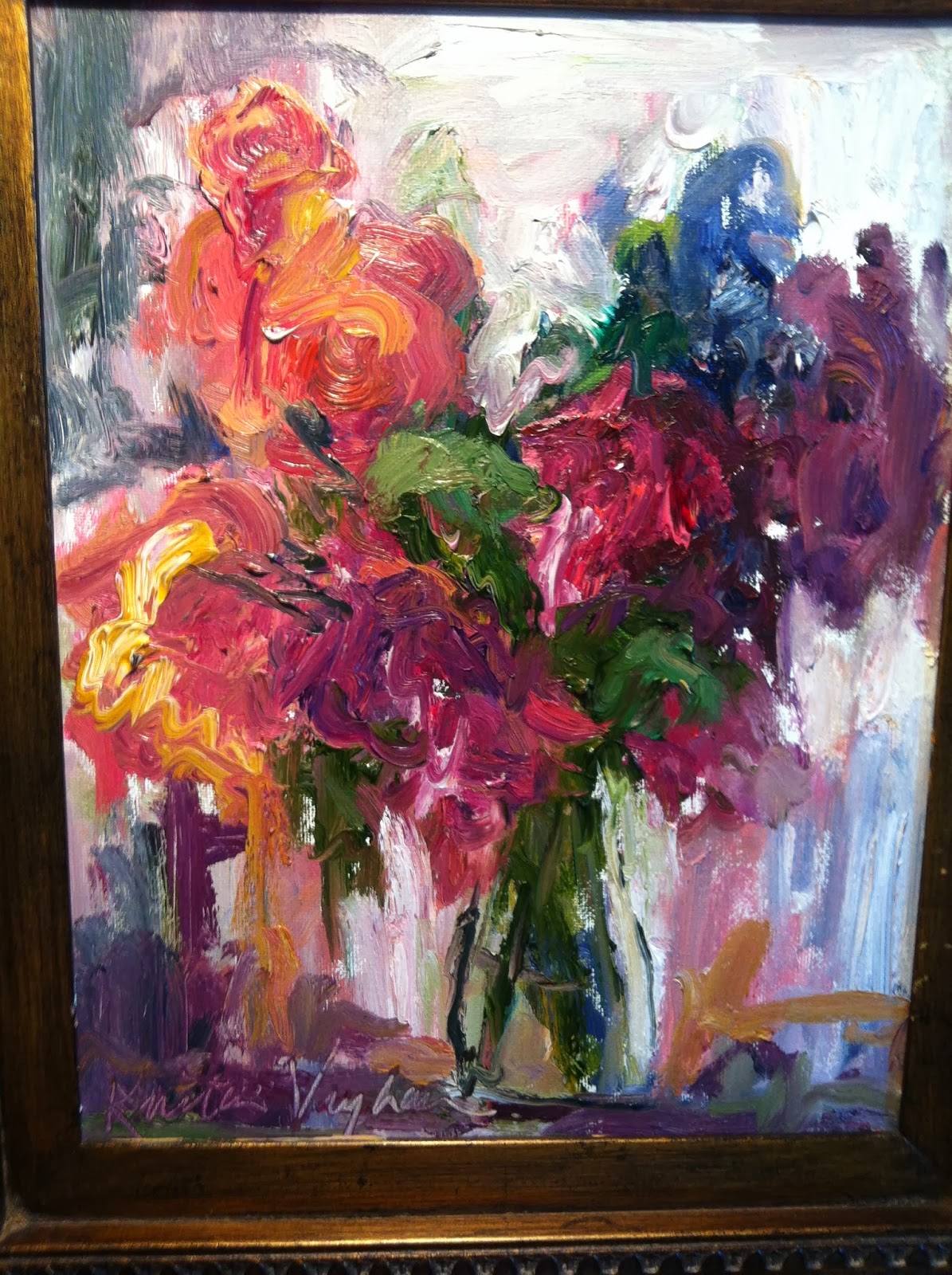
Most flower arrangements come in a nice, rounded shape, packed with flowers. However, if I were to paint all two dozen roses, the product would be a busy mess! I choose to simplify the layout because I don't want too many elements competing for attention. Also If I painted the flowers in a perfectly arranged dome, the viewer's attention would only stay on that one contained area of the canvas. Instead I like to make interesting and organic contours or silhouettes. When there is a sprig of flowers sticking out randomly, it draws the eye and makes the eye follow it till its tip, leading the viewer into the rest of the painting.

I also kept the colors simple. Yellow and purple are complementary colors, meaning if they are put next to each other, they will create a contrast to make each other stand out. If there is warm light coming, the shadows will be of cool colors. As long as I keep the value the same, I can shift the color as many ways as I want. A sky or sunset is a good example of this, but I'm planning to do a post on color mixing eventually.
Because there is a strong source of light, you can see distinct areas of light and shadow on the flowers and table. I typically add something else in the foreground, like a plate, fruit or a book to fill the empty space on the table. Also notice that I never put the vase in the center of the canvas and I always make part of the flowers go off the page. My goal is to make sure the viewer's eye follows to every corner of the canvas. I changed the shape of the table and used a solid color for the background. The pink may stand out a little too much, but usually I mix some shade of grey or a neutral color.
 This is Renoir's original painting titled The Heads of Two Young Girls. I love the softness of the lines and brushstrokes, the saturation of the colors, and the various colors seen in the skin tones. When I copy Renoir's painting, I learn his technique (by trial and error of course) as well as how he interprets his real life subjects. Renoir will express skin tones differently than the High Renaissance artist Michelangelo or the Harlem Renaissance artist Jacob Lawrence.
 On the left is my study of Renoir's piece done in 2011. As you can see, I could not mimic exactly Renoir's smooth edges or his contrast of intense and subtle colors. Every time I do a study of an artists' work, it expands my style and understanding of art.